Many people ask a simple question: “Which screen colour is good for eyes?” The honest answer is that there is no single magic colour that works for everyone in every situation. What matters most is a combination of colour temperature, brightness, contrast, ambient light, and how long you look at the screen.
This guide explains how different screen colours and modes affect your eyes, what helps reduce eye strain, and how to adjust your screen for work, reading, and evening use.
Table of Contents
How screen colours affect your eyes
Why blue light causes more eye strain
Modern screens emit light across the visible spectrum, but they often have a strong peak in the blue range. Blue light carries more energy than longer wavelengths like red or orange. High levels of blue light, especially at night, are linked to:
- Increased visual fatigue
- Disrupted sleep (melatonin suppression)
- Stronger perceived glare on bright white or cold screens
The problem is not “blue” as a colour on its own, but too much high-energy blue light, particularly in dark environments and late in the day.
Warm vs cool colours on screens
Screens can be broadly grouped into:
- Cool colours: white with a bluish tint, cold greys, pure blue
- Warm colours: slightly yellowish/amber whites, warm greys, orange tones
Warm colour temperatures are generally more comfortable for long sessions because they reduce the blue component. Cool whites and bright blues can feel “harsh”, especially in low light, and tend to increase glare and perceived strain.
Is white screen good or bad for your eyes?
When a white screen is useful
A white or very light background is not “evil” by default. It has clear advantages:
- High contrast and good readability for black or dark text
- Natural for reading during the day in a well-lit environment
- Essential for certain tasks (design, photo editing, testing display uniformity)
A slightly off-white background (close to paper colour) often feels more natural than a pure #FFFFFF white, but overall, light backgrounds work well when your room is also well lit.
When white screens cause problems
White screens become a problem when:
- Brightness is too high compared to ambient light
- You use them in a dark room (strong contrast between screen and surroundings)
- You stare at them for long periods without breaks
In these conditions, a pure bright white can cause:
- Glare and discomfort
- Headaches for sensitive users
- Faster visual fatigue
A good rule is to match screen brightness to your environment and, if possible, slightly warm up your white (through a “warm” or “reading” mode) rather than using a cold, bluish white.
Is dark mode really better for your eyes?
Pros of dark mode
Dark mode became popular partly for aesthetic reasons, but it does have some real benefits:
- Less glare in low-light or dark environments
- Lower overall luminance, which can feel more comfortable at night
- On OLED screens, black pixels are off, which can reduce power consumption
For people who work late or use screens in dark rooms, dark mode can reduce the sensation of “being blinded” by a bright white background.
Limits of dark mode
However, dark mode is not automatically better for everyone:
- Text on a dark background can be harder to read for some users
- Thin or low-contrast fonts may be less legible in dark mode
- In bright environments, dark mode can actually make you squint more, because you’re trying to read dim text in a bright room
Dark mode is best seen as a contextual tool:
- Very useful in dark rooms and at night
- Less ideal as a default mode in bright offices or daylight conditions
Are coloured screens (yellow, green, blue) good for eyes?
Is green screen really best for eyes?
There is a persistent myth that “green is the best colour for eyes” because the human eye is most sensitive around the green part of the spectrum. While it is true that our eyes detect green very efficiently, a full green screen is not automatically more comfortable.
Problems with pure green backgrounds:
- They are highly saturated and can feel aggressive over time
- They are not ideal for reading or working with text
- They are rarely used in UI design for large backgrounds, precisely because they can be tiring
Green can be useful in specific contexts (test patterns, special tools), but for day-to-day reading and work, a neutral or slightly warm background is generally more comfortable than a bright green screen.
Is blue screen bad for eyes?
Bright blue screens or very cold whites with strong blue content can:
- Increase the perception of glare
- Make prolonged use less comfortable
- Interfere with sleep if used late at night
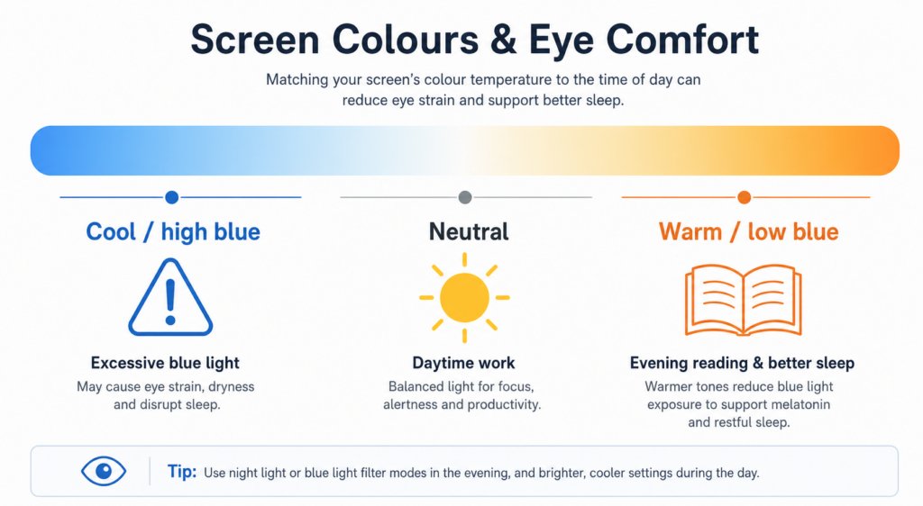
Blue light is particularly problematic in the evening because it sends a “daytime” signal to your biological clock, delaying melatonin production and making it harder to fall asleep. This is why many experts recommend:
- Avoiding cold/blue-heavy screens 2–3 hours before bedtime
- Using warmer modes or night modes at night
During the day, moderate blue content is not inherently harmful, but very bright blue backgrounds are rarely suitable for long reading sessions.
Is yellow or amber screen better for eyes?
Yellow or amber tones reduce the blue component of the light. They are often used in:
- Night modes on smartphones
- “Reading” modes on e-readers
- Software filters that reduce blue light
Benefits of slightly yellow/amber screens:
- Less blue light → potentially better sleep when used in the evening
- Softer, warmer feel that many users find more comfortable for reading
- Reduced perceived glare compared to cold white
However, extremely saturated yellow/orange backgrounds are not ideal for everything. The sweet spot is usually:
- A slightly warm white (like paper under warm light)
- Not a full-on bright yellow page

Which screen colour is best for long reading sessions?
Best colour settings for reading and coding
For long reading, writing, or coding sessions, the goal is comfort + readability:
- Background: light but not pure white, slightly warm (for example a very light beige or “paper-like” tone)
- Text: dark grey or black with good contrast (but not neon colours)
- Avoid high-saturation backgrounds (pure red, green, blue) behind text
- Avoid low-contrast combinations (light grey text on slightly darker grey)
This type of setup mimics reading on paper under warm light. It reduces harsh contrast and blue peaks while keeping text very legible.
Day vs night: different colours, different settings
During the day:
- Light or white background is fine if the room is well lit
- Neutral or slightly warm white is ideal
- Adjust brightness so that the screen is not dramatically brighter than the room
In the evening:
- Use warmer colour temperatures (yellow/amber tint)
- Reduce brightness
- Consider dark mode if you are in a very dark room
- Avoid bright, cold whites and blue-heavy screens close to bedtime
In short, the “best” colour for your eyes depends on time of day + environment. The same white screen that is comfortable at 11am can be harsh at 11pm in a dark room.
Other key factors more important than screen colour
Brightness and contrast
Colour matters, but brightness and contrast often matter more:
- A good colour with too much brightness still causes strain
- A dark mode with extremely low contrast can make reading difficult
- Your screen should not be the only strong light source in a dark room
General rules:
- Match screen brightness to the ambient light level
- Avoid maximum brightness unless you are in very bright surroundings
- Use enough contrast between text and background, but avoid “laser white on pure black” extremes if they bother you
Distance, posture and breaks
Even with perfect colours, your eyes will suffer if you:
- Sit too close to the screen
- Never blink (very common when concentrating)
- Never take breaks
Good practices:
- Keep the screen at least an arm’s length away
- Top of the screen roughly at or slightly below eye level
- Use the 20-20-20 rule: every 20 minutes, look at something 20 feet (6 m) away for 20 seconds
- Remember to blink to avoid dry eyes
Screen colour is one piece of the puzzle; ergonomics and habits are equally important.
So, which screen colour is good for eyes?
There is no single universal answer, but we can summarise the evidence and practical experience like this:
- For daytime work:
- A light, slightly warm background (off-white, light beige)
- Dark text with good contrast
- Neutral or mildly warm colour temperature
- For evening and night use:
- Warmer colours (amber/yellow tint)
- Reduced brightness
- Optional dark mode in very dark rooms
- Avoid bright cold white and blue-heavy screens close to bedtime
- Colours to avoid as permanent backgrounds:
- Highly saturated pure colours (bright green, pure red, full blue)
- Very bright, cold whites in dark environments
Ultimately, comfort is the key metric. If a slightly warm, low-glare setup lets you read for longer with less fatigue, that’s “the best colour” for your eyes in practice—even if it’s not a single fixed hue.
Related tools and guides
If you want to go deeper:
- To learn what each solid screen colour is used for (testing dead/stuck pixels, productivity, sleep, photography), read our screen colors guide on WhiteScreen.top.
- Use our white, yellow and orange screens to experiment with different background colours for your work or reading sessions.
- Combine colour adjustments with Pomodoro timers to integrate regular breaks into your screen routine.
Sources: Optometrists / Opticians (Canada, Europe) – Blue light and eye strain, Canadian Centre for Occupational Health and Safety – Display colours and ergonomics