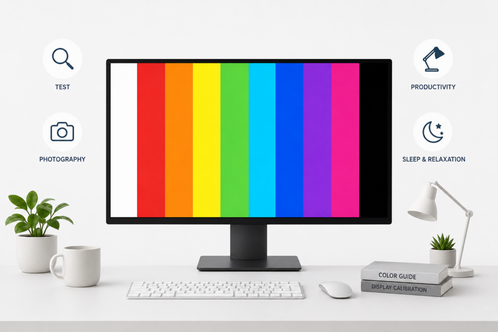
Screen colors are practical tools that serve far more purposes than simple visual display. After helping thousands of users test their displays and optimize their work environments, we’ve created this comprehensive guide covering every essential use case for color screens.
From testing hardware defects to creating optimal work environments, understanding how to use each color screen transforms your monitor into a versatile diagnostic and productivity tool. Whether you’re a photographer preserving night vision, a remote worker reducing eye strain, or someone checking a new display for defects, this screen color guide provides evidence-based recommendations for choosing the right screen color.
Table of Contents
What are color screens used for?
A color screen displays a single, uniform color across your entire monitor. This simple concept enables multiple professional and personal applications that go beyond everyday computer use.
Screen testing and quality control
Color screens reveal manufacturing defects and calibration issues invisible during normal use. When you display pure white or black, irregularities in brightness, dead pixels, and backlight bleeding become immediately apparent. Display manufacturers and technicians rely on these tests to verify quality before products reach consumers.
Professional reviewers test every new monitor with solid color screens to identify defects within warranty periods. We recommend testing new displays within the first 30 days when return policies offer maximum flexibility.
Ambient lighting and relaxation
Solid color screens create controllable ambient lighting that influences mood and reduces eye strain. A soft warm screen provides gentle illumination for reading physical documents without harsh desk lamps. Dynamic color transitions help create meditation spaces and relaxation environments.
Many of our users report that dim amber or orange screens before bedtime promote better sleep compared to standard white-heavy displays. Research confirms that minimizing blue light exposure in the evening supports healthy sleep patterns.
Photography and videography
Photographers use color screens as reference tools and improvised light sources. A neutral grey screen serves as a color calibration reference when adjusting camera white balance. Large displays showing pure white provide affordable softbox-style lighting for product photography or video calls.
Red screens preserve night vision during astrophotography sessions. The National Park Service confirms that red light allows photographers to check settings without compromising their dark-adapted vision, which can take 20-30 minutes to fully develop.
Work productivity and focus
Screen colors affect concentration and work performance. Yellow and warm tones reduce eye strain during extended reading or coding sessions. Black screens provide privacy mode for audio-focused work, while specific colors create distraction-free environments that enhance focus.
Remote workers and students use color screens to signal work modes and minimize visual distractions during deep concentration periods.
White and black screens
White and black represent the two extremes of display testing and serve distinct purposes for both diagnostics and practical applications.
What is a white screen used for?
A pure white screen pushes your display to maximum brightness across all pixels, revealing several common defects. Backlight bleeding appears as bright spots or uneven illumination around screen edges, particularly noticeable in darkened rooms. Color temperature variations show as slight yellow, blue, or pink tints in different screen areas, indicating calibration problems.
Beyond testing, white screens serve practical everyday purposes. They function as emergency flashlights when you need temporary lighting without specialized equipment. Video conference participants use white screens as fill lighting to improve webcam appearance. Designers use white backgrounds to verify how colors and designs appear against bright surfaces before client presentations.
What is a black screen used for?
Black screens reveal defects invisible on lighter backgrounds. Stuck pixels glow bright against pure black, making them impossible to miss even from normal viewing distance. Light leakage from the display’s backlight becomes apparent, showing whether the LCD panel properly blocks light when displaying dark content.
Black screens reduce power consumption on OLED displays where black pixels actually turn off, extending battery life on laptops and smartphones. They provide privacy mode for audio playback without visual distraction during phone calls or music listening. Many users keep a black screen open during break periods to give their eyes rest from constant visual stimulation.
Primary color screens (Red, green, blue)
Primary colors test individual sub-pixel performance while serving specific practical applications based on how displays create color through sub-pixel combinations.
What are red screens used for?
Red screens test the red sub-pixels in your display while keeping green and blue sub-pixels off. This isolation helps identify dead or weak red sub-pixels that might not appear during normal viewing. Red carries the lowest energy of visible light colors, making it ideal for nighttime use without disrupting circadian rhythms.
Photographers and astronomers use red screens to preserve night vision during outdoor sessions. The human eye adapts to darkness through rhodopsin, a light-sensitive protein that red light doesn’t break down as readily as white or blue light. This allows astrophotographers to check camera settings, navigate equipment, and review images without losing their carefully developed night vision.
This section focuses on how red screens are used for testing and night vision. If you’re wondering whether red is actually good for your eyes in everyday use, you can read our dedicated article “Is red good for your eyes?”.
What is green screen good for?
Green occupies the center of the visible spectrum where human eyes show peak sensitivity. A green screen appears brightest at the same power level compared to red or blue, explaining why night vision devices and emergency exit signs use green for maximum visibility. Your eyes contain more green-sensitive cone cells than red or blue, making green the easiest color to perceive.
For display testing, green screens reveal the most common sub-pixel issues since green sub-pixels typically outnumber red and blue in modern RGB displays. Some users find green screens energizing and refreshing for morning work sessions. However, prolonged exposure to bright green can cause faster eye fatigue than neutral colors due to the intensity at which our eyes perceive this wavelength.
What are blue screens used for?
Blue screens test blue sub-pixels and reveal color rendering capabilities across the display. Creative professionals use blue screens as color correction references or lighting effects in product photography. Blue light provides alertness and energy during morning hours when you want to signal your body to wake up.
However, blue light carries the highest energy in the visible spectrum and most significantly affects circadian rhythms. The Sleep Foundation’s research shows that extended exposure to bright blue screens, especially before sleep, suppresses melatonin production and disrupts sleep patterns. Blue light exposure within 2-3 hours of bedtime can delay sleep onset and reduce sleep quality.
Use blue screens strategically for morning alertness or technical testing, but switch to warm colors like orange or red for evening work.
Warm color screens (Yellow, orange, brown)
Warm colors combine red and green sub-pixels in different ratios, creating comfortable viewing experiences while testing multiple sub-pixel types simultaneously.
What is yellow screen used for?
Yellow screens (red + green sub-pixels) provide warm, low-strain illumination popular for reading and studying environments. The absence of blue light makes yellow screens ideal for evening work sessions when you want to maintain productivity without disrupting your upcoming sleep.
Many students and remote workers use yellow screens during extended reading or document work to reduce eye fatigue. Scientific research on screen brightness and visual fatigue confirms that warmer color temperatures reduce strain during prolonged viewing. Yellow creates a focused ambiance that many find conducive to concentration without the harshness of pure white.
When to use orange screen?
Orange screens offer a warmer alternative to pure red for night-friendly computing. They provide more visibility than red screens while still minimizing blue light exposure that disrupts sleep hormones. Orange represents an ideal middle ground between the extremely low energy of red and the potentially sleep-disrupting effects of yellow.
Photographers use orange screens for creative lighting effects in product shoots, creating warm atmospheric tones. The color works well for mood lighting during evening relaxation, providing enough visibility for navigation while maintaining a calming atmosphere.
What is brown screen used for?
Brown screens (dark orange, essentially red + reduced green) provide the warmest ambient lighting option after red. The muted tone offers eye comfort during very long work sessions without the intensity of brighter warm colors.
Creative professionals use brown screens for natural, earthy mood lighting that doesn’t dominate their workspace. Brown tests your display’s ability to render complex warm tones requiring precise red and green sub-pixel balance.
Cool and creative color screens
Secondary colors and specialized hues serve aesthetic and testing purposes by combining different sub-pixel pairs or creating specific atmospheric effects.
What is cyan screen used for?
Cyan screens (green + blue sub-pixels) create cool ambient lighting with calming effects. The color tests two sub-pixel types simultaneously, revealing issues in how your display mixes green and blue channels. Cyan appears frequently in design work, making cyan screens useful for previewing how designs look against cool-toned backgrounds.
Some users find cyan energizing without the harshness of pure blue or the potential sleep disruption. The color provides moderate brightness while maintaining a cool, professional atmosphere suitable for creative work environments.
When to use purple, pink, or magenta screens?
Magenta and purple screens (red + blue sub-pixels) test your display’s ability to render colors without green component. These screens help identify issues in red and blue sub-pixel coordination. Creative professionals use purple and pink screens for mood lighting in artistic workspaces, creating unique atmospheric effects for photography studios or content creation environments.
Pink screens (lighter magenta) provide softer ambient lighting with aesthetic appeal for personal spaces. These colors work well for party and entertainment settings, creating distinctive visual atmospheres.
What is grey screen used for?
Grey screens at 50% brightness effectively reveal backlight uniformity issues that pure white might mask. Professional calibrators use grey screens to check for tint variations across the display panel. Grey provides neutral ambient lighting without the intensity of white or the darkness of black, offering a middle ground for extended viewing.
Photographers use grey screens as white balance and exposure references because grey represents a neutral tone without color cast. Testing with multiple grey levels (25%, 50%, 75%) reveals whether your display can accurately reproduce neutral tones across the brightness range, essential for photo editing and design work.
Dynamic color effects
Moving beyond static colors, dynamic screens create shifting patterns and transitions for entertainment, relaxation, and advanced display testing.
What are mood lights used for?
Mood lighting screens offer slow, gentle color transitions designed for relaxation rather than stimulation. Colors fade gradually from one hue to another over minutes, creating ambient lighting that shifts atmosphere without demanding attention. These displays provide calming visual backgrounds for meditation, yoga sessions, or simply creating peaceful home environments during evening relaxation.
The slow transitions engage peripheral vision without requiring focus, making mood lights ideal for background ambiance during reading, conversation, or other activities. Many users combine mood lighting screens with music or ambient sounds to create multisensory relaxation experiences.
What is northern lights simulator?
Northern lights simulators replicate the flowing green, purple, and blue patterns of aurora borealis. These displays recreate the organic, undulating movements of natural auroras, providing meditative visual experiences. The simulation offers therapeutic visual engagement for people who find natural phenomena calming but cannot travel to aurora-visible regions.
Mental health professionals sometimes recommend aurora simulations as visual meditation aids, providing focal points for mindfulness practice.
When to use party lights?
Party light modes transform your screen into an entertaining decorative element with rapid color changes and vibrant patterns. These displays work for celebrations, background visuals during social gatherings, or creating energetic atmospheres for creative work.
Content creators use party light backgrounds for video recordings or livestreams, adding dynamic visual interest. The random color patterns ensure comprehensive testing of your display’s full color gamut under rapidly changing conditions.
Are strobe screens safe to use?
Warning: Strobe effects can trigger seizures in individuals with photosensitive epilepsy. Never use strobe screens without confirming all viewers can safely view flashing lights. Always include clear warnings before enabling strobe features, and never use them as default settings.
When used responsibly with appropriate warnings, strobe screens serve specific technical purposes including testing display response times and examining motion blur characteristics. The rapid switching provides the most demanding test of display performance, revealing capabilities invisible during normal use.
How to test your screen for problems
Systematic screen testing reveals defects early, validates display quality before warranty periods expire, and ensures you’re getting the performance you paid for.
How do I check for dead pixels?
Follow this testing sequence for thorough pixel examination:
- Clean your screen with a microfiber cloth to eliminate dust specks that mimic pixel defects
- Display a pure white screen and slowly scan for any black dots (dead pixels)
- Switch to pure black and look for bright colored dots (stuck pixels)
- Cycle through red, green, and blue screens, checking for pixels that don’t illuminate
- View the screen from multiple angles, as some defects appear more visible from certain positions
Most manufacturers allow a specific number of defective pixels before qualifying for replacement. Document any defects with photos showing their screen location, and note whether they’re dead (always black) or stuck (showing constant color). Test new displays within the first 30 days when return policies and warranties offer maximum flexibility.
How do I check for stuck pixels?
Stuck pixels display constant color because one or more sub-pixels remain permanently on. They appear as bright red, green, blue, cyan, magenta, or yellow dots against black backgrounds. Unlike dead pixels which receive no power, stuck pixels are electrically active but cannot change state properly.
Display a black screen and examine the entire panel systematically, dividing it mentally into sections to ensure complete coverage. Stuck pixels glow brightly against black, making them easier to spot than dead pixels on white. Once identified, note their exact location and color.
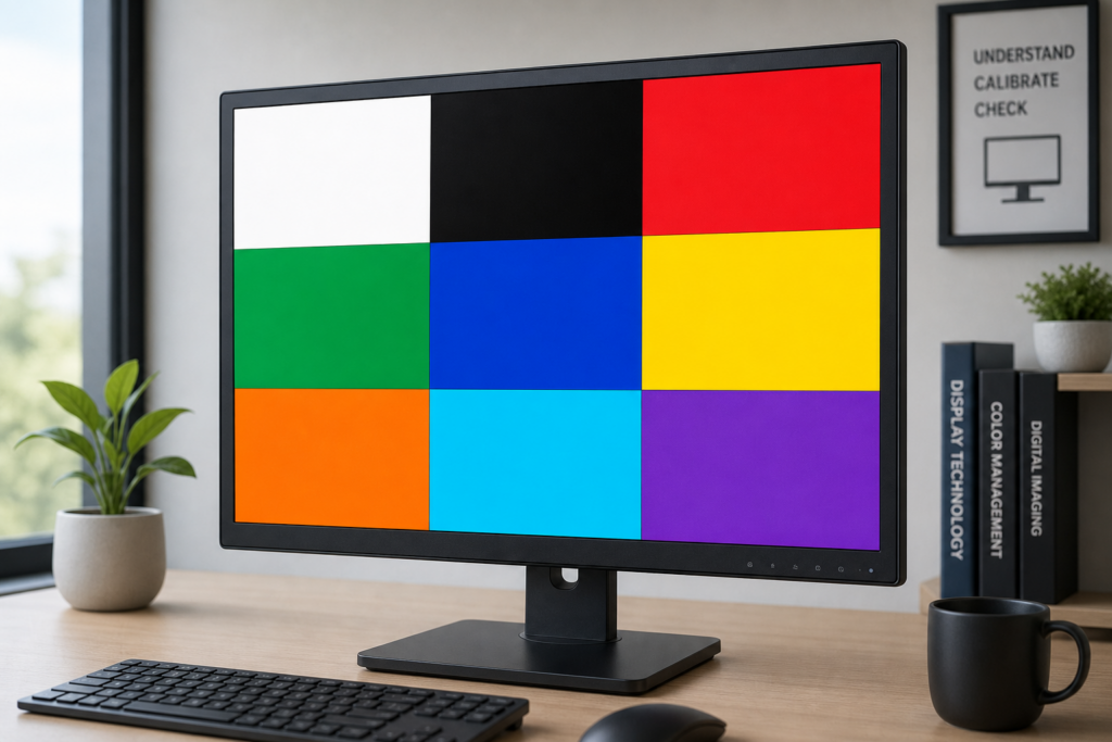
How can I test my screen color accuracy?
Color accuracy testing requires comparing your display against known standards:
- Display white and grey screens to check for color casts appearing as yellow, blue, or pink tints across the panel
- Use gradient screens to reveal banding issues where smooth color transitions appear stepped or posterized
- Test viewing angles by observing color shifts when viewing from sides, above, and below center position
- Compare primary colors (red, green, blue) at full saturation to verify they appear pure without contamination from other colors
- Check whether blacks appear truly black or washed out grey, indicating poor contrast ratios
Professional calibration requires specialized colorimeter hardware, but these basic tests reveal major quality issues immediately apparent to most users.
How do I fix a stuck pixel?
Stuck pixels sometimes respond to repair techniques, though success rates vary. The most common method involves rapid color cycling that exercises the stuck sub-pixel, potentially freeing it from its stuck state. Display rapidly flashing colors (changing every few milliseconds) for 20-30 minutes in the area containing the stuck pixel.
Some users report success with gentle pressure applied to the stuck pixel location while the screen displays black, then releasing pressure as colors change. This physical technique carries risk of creating additional problems, so attempt it carefully if at all. Success rates range from 20-60% depending on the stuck pixel’s nature and your display technology. Dead pixels cannot be repaired through software techniques and require hardware replacement.
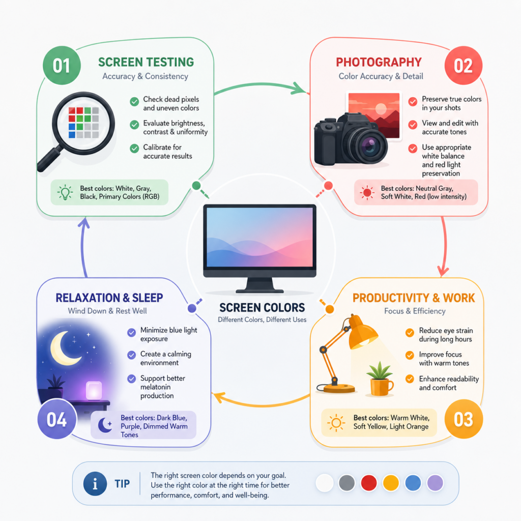
Which color screen should I use?
Selecting the right color depends on your specific needs, time of day, and intended purpose. This reference guide helps you choose quickly.
Best colors for testing your display
White screens reveal backlight bleeding, brightness uniformity, and dead pixels appearing as black dots. Black screens show stuck pixels, light leakage, and contrast capabilities. Grey screens (50% brightness) display backlight uniformity issues more clearly than pure white. Red, green, and blue screens test individual sub-pixel performance.
For comprehensive pre-purchase testing, cycle through all primary colors plus white, black, and grey. This complete sequence reveals the widest range of potential defects within 5-10 minutes.
Best colors for work and productivity
Yellow screens reduce eye strain during reading, writing, and document work. The warm tone maintains visibility while eliminating blue light that causes fatigue during extended sessions. Orange provides slightly warmer alternative for late afternoon and evening work when you want to transition away from stimulating colors.
Avoid blue screens during long work sessions unless you specifically need morning alertness. For variety during extended work days, alternate between yellow (morning/afternoon reading), white (general computing), and orange (evening sessions).
This section focuses on productivity and usage. If you want to understand how these colours impact eye comfort and long-term visual fatigue, you can read our article “Which screen colour is good for eyes?”
Best colors for better sleep
Red and orange screens provide the least sleep disruption for nighttime computer use. These warm colors don’t suppress melatonin production like blue and green wavelengths. Avoid blue screens entirely within 2-3 hours of your intended bedtime, as blue light signals your body to stay awake.
Amber and brown screens offer middle-ground options providing more visibility than pure red while maintaining sleep-friendly characteristics. If you must use your computer before bed, switch to warm colors at sunset or 2-3 hours before sleep, whichever comes first.
Best colors for photography
Red screens preserve night vision during astrophotography and wildlife photography sessions. Your dark-adapted vision remains functional under red light, allowing you to check camera settings without waiting another 20-30 minutes for your eyes to re-adapt to darkness.
Grey screens provide neutral references for white balance and exposure calibration. White screens serve as improvised fill lights for product photography, headshots, and video calls when positioned appropriately.
Color screen tools directory
Access these color screen tools organized by category for quick reference. Each tool opens in fullscreen mode for maximum effectiveness.
Essential testing screens
- White screen – Maximum brightness testing, backlight bleeding detection
- Black screen – Stuck pixel detection, contrast testing, power saving
- Grey screen – Backlight uniformity, neutral calibration reference
- Dead pixel checker – Automated pixel defect detection
- Stuck pixel fix – Rapid color cycling to attempt pixel repair
All color screens
- Red screen – Night vision preservation, red sub-pixel testing
- Green screen – High visibility, green sub-pixel testing
- Blue screen – Blue sub-pixel testing, morning alertness
- Yellow screen – Reading comfort, reduced eye strain
- Orange screen – Evening work, blue light reduction
- Cyan screen – Cool ambient lighting
- Purple screen – Creative lighting effects
- Pink screen – Aesthetic ambient lighting
- Brown screen – Warm natural lighting
Ambient and dynamic screens
- Mood lights – Slow color transitions for relaxation
- Northern lights simulator – Aurora borealis visual experience
- Party lights – Rapid color changes for entertainment
- Psychedelic lights – Complex patterns and visual effects
- Strobe effect – ⚠️ Warning: May trigger seizures
Sources: Sleep Foundation, National Center for Biotechnology Information, NDE-Ed.org